The Path to Tokyo
↳ Idea Generation ↳ Design Development ↳ Styleguide Delivery ↳ Motion Design
Separating from the pack.
Intel host a vast array of Esports events, but the Intel World Open is the first event of its kind to be endorsed by the Olympics. For the first time, players from around the world can compete in online qualifiers in a bid to represent their country on the world stage in Tokyo.
The Path to Tokyo
The idea is born out of circuit-boards, their journey & destination, path and component. Representing each competitor’s journey to the finals. These were simplified to gates and pathways, embracing the digital futuristic tonality.


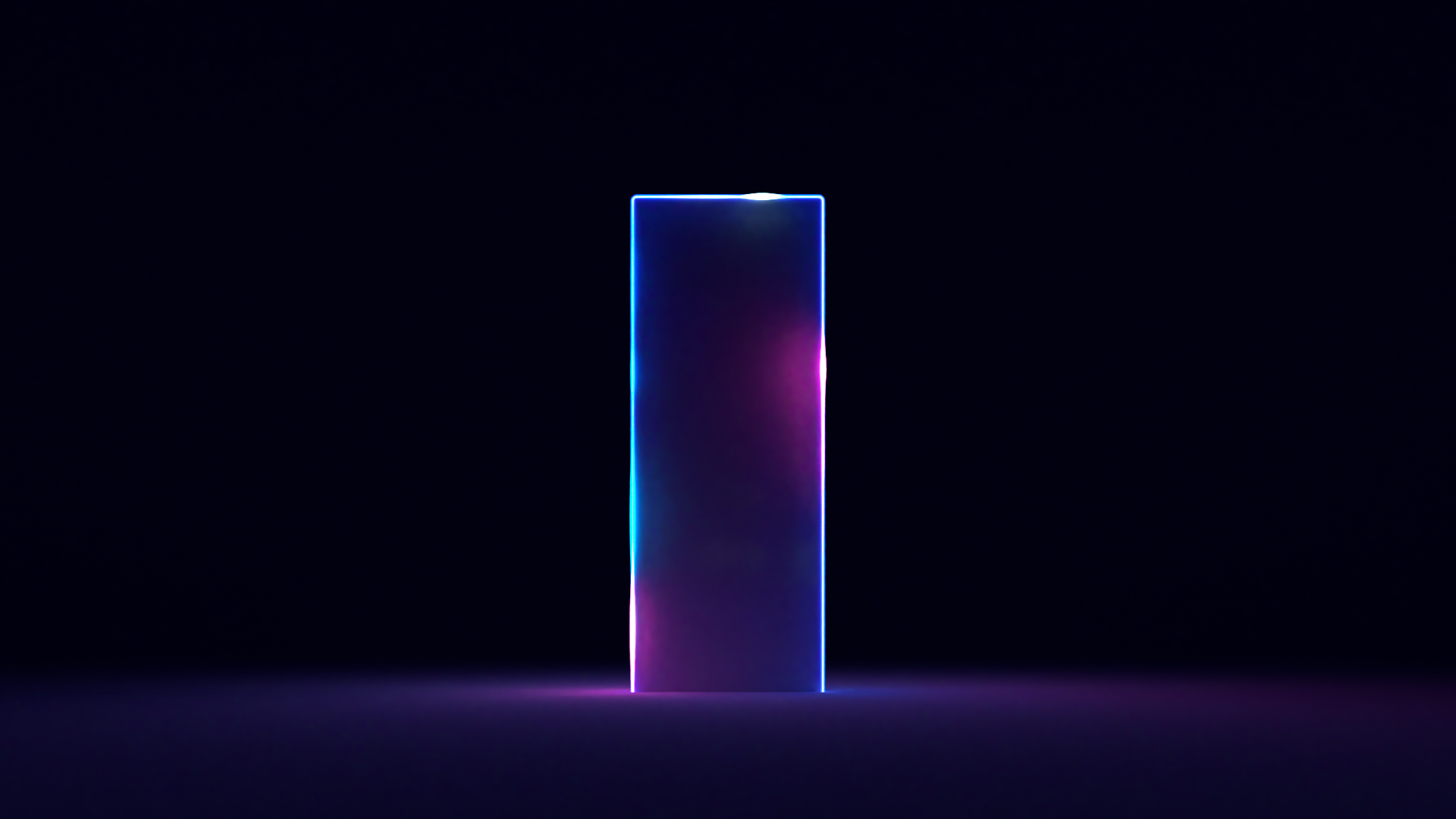
The Gate
The gate represents the destination to a specific journey. On the gate, the colour is varied. Whilst predominantly blues, it does also include an additional, subtle magenta glow. This creates its distinctive look and feel, that’s especially effective when animated.


The Path
The paths represent the journey of both the player and the fans toward the event. Our ‘illuminated’ pathways match our Intel blue and radiate a glow, reacting and effecting its surroundings as it journeys towards its destination.
Styleguide & Assets
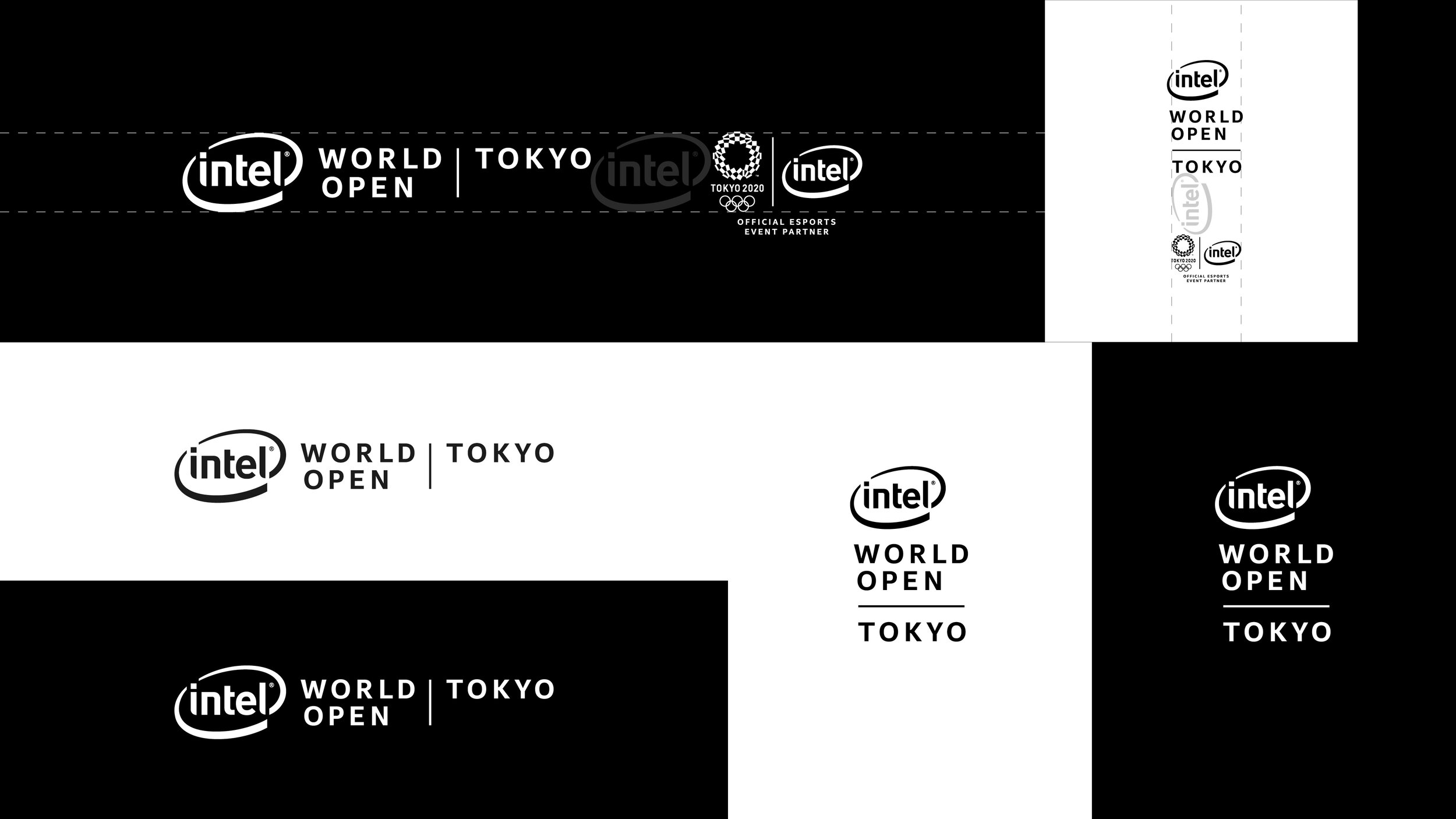
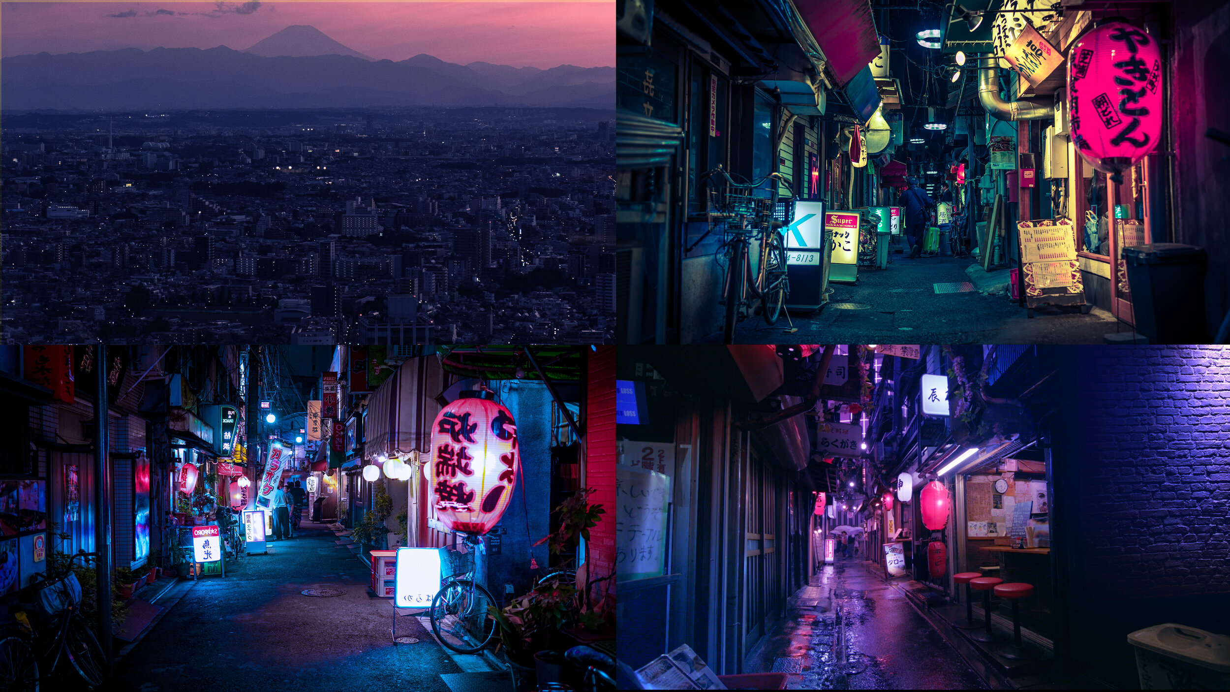
We developed a look and feel to the brand that needed to be grounded in, yet separate to the Intel core brand. All the imagery is colour treated for consistency, making it highly distinctive to the Intel World Open. The imagery has an aesthetic of gritty, ethereal intrigue, with a sense of journey – The Path to Tokyo. Our colour palette is born out of the Intel colour scheme, taking the Intel Blue and Dark Blue. To create a richer palette more in line with the brand identity, we added a mid and a teal blue to the palette. Similarly we used Intel Clear as the typeface but tracked it out to 200 creating a more modernist feel to the typeface.
Using this guide we produced a series of Assets for the partners of the event to use on their platforms (Street Fighter & Rocket League), as well as Intel themselves through its channels.


Website
The website uses all of the elements to deliver a fully rendered example of the visual identity in action. It incorporates the branding, imagery, moving image, typography, colours, paths and gateways.
Event Concepts
We produced a series of event concepts which we felt encapsulated the gates and paths in an engaging and imaginative way. Including live commentary pathways, Gate entries and takeaway fan zines.

